It might have been 2006 or 2007 when I first saw someone wearing a shirt with the graphic from Joy Division's
Unknown Pleasures. I didn't know who Joy Division were, but thought they were obviously not the type of band I'd be into (I was exclusively into peppier, poppy british stuff at the time i.e. Coldplay, Keane, Franz Ferdinand, etc...).
Still, the graphic was really arresting, I was very very intrigued. Apparently I wasn't intrigued enough to do anything about my curiosity, since at this point in my life, I wasn't much of an explorer. I never downloaded songs and youtube wasn't as big as it is now. But that band name and that image always stuck in my head.
Sometime later, I was working in a movie theater and a few of my coworkers were buzzing about
Control, the Ian Curtis biopic (great movie btw). I watched the trailer with them, where I recognized the song
Love Will Tear Us Apart. After that, I timidly asked my coworker if it would be poseur-ish to wear a shirt for a band you've never listened to before. When he asked who, and I answered, he laughed and said he'd lend me some of their albums.
So, he did, and I listened, and was immediately hooked. I truly loved the music and still love it to this day. I never would've thought I'd be so into the post-punk genre, but I really am. Because of Joy Division's music, it gave me a notion that there might be a lot of other musicians I might like from that era. I discovered
New Order (who is Joy Division minus Ian Curtis),
The Cure,
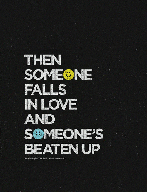
The Smiths,
Bowie, and many many others. The music I listen to nowadays really plays a big part in my life, and has indirectly done wonders on my
portfolio...
And it's all because of this album cover, which was designed by the brilliant
Peter Saville. He was the graphic designer for the now long-dead
Factory Records, which practically built the Manchester music scene (a city which produced countless, world-famous acts such as The Smiths and
Oasis).
Peter Saville is a huge influence on me, personally, even though most of the work he did was
copied or
borrowed. Even so, he's a
brilliant personality and has been doing work with musicians for more than 30 years.
This one image changed my entire life, which proves, if nothing else, that Graphic Design is capable of doing great things to people.
For more on the Unknown Pleasures album cover, see
HERE.
For More on Joy Division, I recommend
THIS FILM.
-Caroline
(p.s. I own the shirt now. It took two years for me to buy it and I wear it at least once a week. Favorite shirt ever.)