28.4.10

Need to Want Less


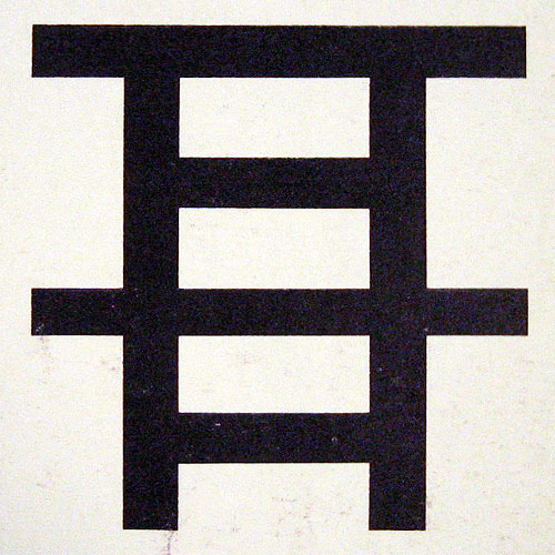
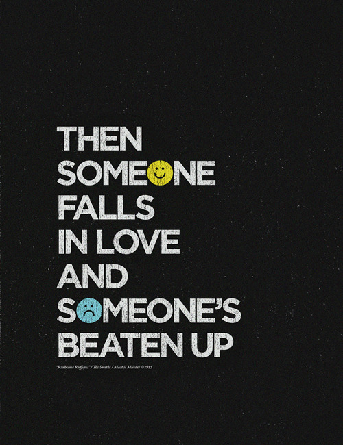
Saw this popping up around FFFFound, which eventually brought me to the flickr page. There are tons of these things! Some profound, some just silly.

Recovering Lazyholic. <--This lady has a terrific and thorough portfolio besides!

And she also has a SHOP!!!

26.4.10

Scandinavian Logos


I agree with Nubby Twiglet, these logos from the 60s an 70s are totally swoon-worthy.

20.4.10

London Print


Oooh, wish I'd thought of this first. Let's hope these are available for purchase sometime soon.

Blanca Gomez

31.3.10

Ffffound of the day


Stunning.

VIA

Wim Crouwel


From Grain Edit:

Wim Crouwel fans rejoice!

The Het Geheugen van Nederland (The Memory of the Netherlands) is a dutch website that contains an extensive collection of illustrations, photographs, texts, film and audio fragments, all of Dutch making. They have an impressive archive of work by Wim Crouwel. Over 500 original designs by Wim and his partners at Total Design lay in wait for your perusing pleasure. Enjoy!

5.3.10

Map


I just saw that the Walker is featuring Eddie Opara as part of their Design Lecture Series on Tuesday. His company, MAP, has some wonderfully minimalist and striking designs. I may have to check this guy out. I knew I joined AIGA for a reason.

Magic?


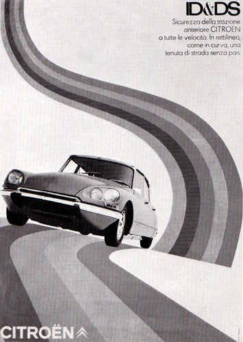
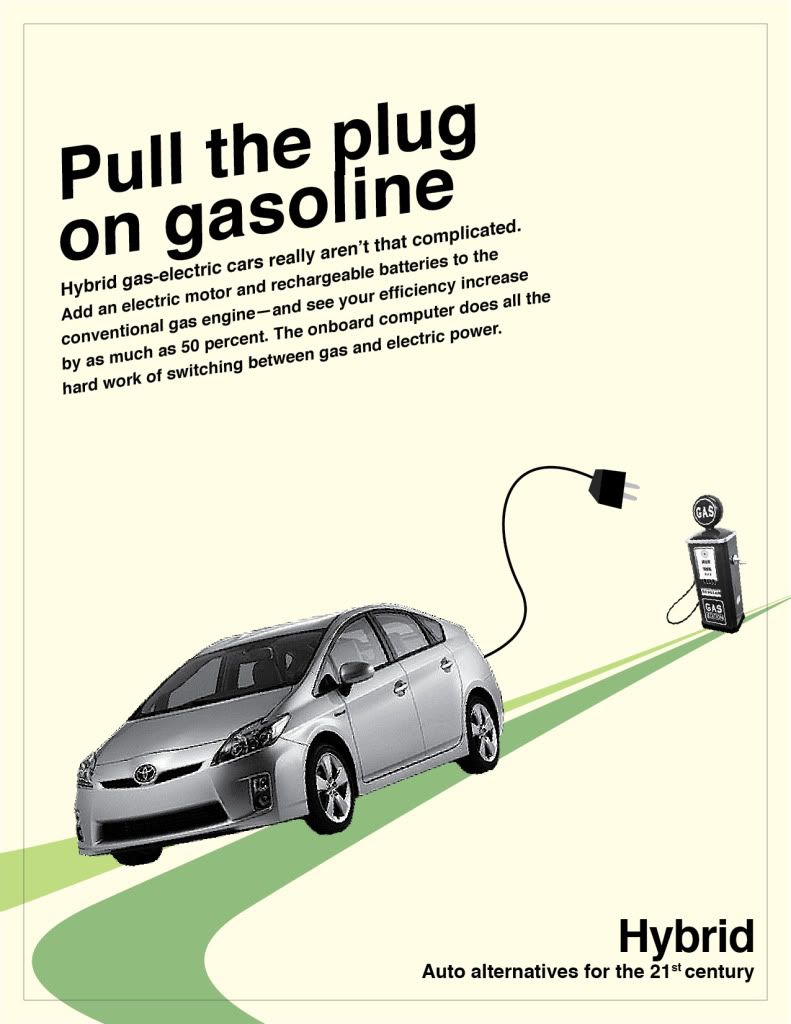
I just found this, like, two minutes ago on Flickr, and felt a bit of deja vu, because I designed an ad very similar last semester in my Layout 2 class. I think if nothing else, this proves that my style is so deeply embedded in the 1960s, and I know enough about it (just by independent research) to be able to take influence from an ad... Without ever having seen it before.

True Faith


Bizarrely, I found this blog entry (from more than 2 years ago) through google images. Not, mind you, by looking for Peter Saville designs, or New Order sleeves, but for "Bauhaus." What's weirder is that I just bought this 12" single... Last night at 10 PM.
It compelled me to read the blog and a few of his others, and now I'm really looking forward to getting home and watching this video. If I could listen to ANYONE talk about Bauhaus, it would be Peter Saville. Good blog.

Happy Unofficial Peter Saville week friends!

A PIECE OF MONOLOGUE

4.3.10

Sonnenzimmer


Wow, what an insanely beautiful collection of work! Please, check out their POSTER SHOP for more lovelies.

3.3.10

Bauhaus t-shirt


(The band, not the school)
You better believe if I was a Bauhaus fan, I'd have this shirt.
I'm soo, so tempted.

1.3.10

Album Covers- New Order


While I'm on the subject of Peter Saville and his work with musicians, I present the cover for New Order's Power, Corruption & Lies. Before I'd even heard the album, I imagined it to be very melodic and rich. It sort of is, blended with warm synths and stark mechanic beats. I wouldn't say it's my favorite album of theirs, but for some reason (and I can't figure out why), I am simply enamored with the album art. I have a strong urge to look at this every morning when I wake up.

The sudden urge to gush about this cover was spurred by the Royal Mail's Album Cover Stamp Set, which features this album cover... It's a really strange selection. I would've chosen Aladdin Sane over Ziggy Stardust in terms of iconic imagery... Not only that, but I think Unknown Pleasures is far more representative of Saville's iconic career than the aforementioned Power, Corruption & Lies, despite both being great covers.

28.2.10

The album cover that changed my life


It might have been 2006 or 2007 when I first saw someone wearing a shirt with the graphic from Joy Division's Unknown Pleasures. I didn't know who Joy Division were, but thought they were obviously not the type of band I'd be into (I was exclusively into peppier, poppy british stuff at the time i.e. Coldplay, Keane, Franz Ferdinand, etc...).

Still, the graphic was really arresting, I was very very intrigued. Apparently I wasn't intrigued enough to do anything about my curiosity, since at this point in my life, I wasn't much of an explorer. I never downloaded songs and youtube wasn't as big as it is now. But that band name and that image always stuck in my head.

Sometime later, I was working in a movie theater and a few of my coworkers were buzzing about Control, the Ian Curtis biopic (great movie btw). I watched the trailer with them, where I recognized the song Love Will Tear Us Apart. After that, I timidly asked my coworker if it would be poseur-ish to wear a shirt for a band you've never listened to before. When he asked who, and I answered, he laughed and said he'd lend me some of their albums.

So, he did, and I listened, and was immediately hooked. I truly loved the music and still love it to this day. I never would've thought I'd be so into the post-punk genre, but I really am. Because of Joy Division's music, it gave me a notion that there might be a lot of other musicians I might like from that era. I discovered New Order (who is Joy Division minus Ian Curtis), The Cure, The Smiths, Bowie, and many many others. The music I listen to nowadays really plays a big part in my life, and has indirectly done wonders on my portfolio...

And it's all because of this album cover, which was designed by the brilliant Peter Saville. He was the graphic designer for the now long-dead Factory Records, which practically built the Manchester music scene (a city which produced countless, world-famous acts such as The Smiths and Oasis).
Peter Saville is a huge influence on me, personally, even though most of the work he did was copied or borrowed. Even so, he's a brilliant personality and has been doing work with musicians for more than 30 years.


This one image changed my entire life, which proves, if nothing else, that Graphic Design is capable of doing great things to people.

For more on the Unknown Pleasures album cover, see HERE.
For More on Joy Division, I recommend THIS FILM.

-Caroline

(p.s. I own the shirt now. It took two years for me to buy it and I wear it at least once a week. Favorite shirt ever.)

Well hello, gorgeous


Just about died when I saw this.
The 60's. Can they do no wrong?

16.2.10

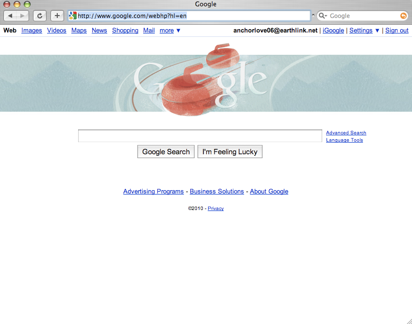
Google graphics


Loving the Olympics theme from Google's award winning design team. (How awesome would it be to have that job??)

(click for larger view)

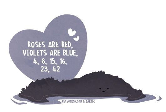
Lost Valentines


So, the new season of LOST is so far pretty swell, but I have to say I'm a tad more enthralled by the recent Lost-related design cropping up on the internets. There were yesterday's Lost posters and just now I've come across (two days too late) these nifty little illustrated Lost-themed Valentines. I really lol'd at the bottom one. Oh, just classic.

BEAVOTRON