29.4.09

This. Shirt. Is so. COOL.


If it was perhaps a little cheaper, I'd be buying that so fast you can't even imagine.

URBAN OUTFITTERS

Wishlist- ITC Avant Garde Gothic


I've really been digging this font for a long time. It's just that lately I've been so consumed by Helveticasms that I don't seem to notice anything else anymore. But anyway, this font is really expensive and when I get my hands on it, I don't know. What I do know is that it's gorgeous and I want it.

Wishlist- Wall Clock from Askul


Who knew a clock could be so striking just based on which numbers are chosen to be shown?

ASKUL

Ooh lovely.


MADE BY SAWDUST

27.4.09

Earth


I don't know what this is but it's cool

My Birthday Flyer


I am truly a minimalist when it comes to design. Just whipped up this morning. I quite like it. Just wanted to show it off a bit, because I know you were all wondering "she loves to gush about all these designs, but what can she actually do?" Yeah, well here's just a sample. Obviously blurring the address cheapens it. But oh well. Price for security.

I'm aware how stuck up I sound.

26.4.09

Motivational Poster?


I'll admit, I'm growing weary of posters that just make blatant statements such as this one, but I quite like the aesthetic. Maybe there should just be one that says "Get your shit together." I think I'll make it.

25.4.09

Iskra Print Collective


I endorse THESE GUYS

I want to be wedded to this


A couple weeks ago I made a poster for a class and did a style very very similar to this. Helvetica in the upper left hand corner, and a big circle in the middle. It wasn't met well only because it didn't quite fit the subject matter. Still, I've been thinking non-stop about it lately and just by chance, I came across this poster from 1963 this morning on ffffound. I was like "whoa, I've dreamed about this poster before."

The Hold Steady tour poster


Feeling productive today.

Check out GIG POSTERS for more

I'm Not There Movie Poster


I liked the ORIGINAL POSTERS, but this is 1000 times more awesome!

See other poster remakes from ALDOUS MASSIE.

Check out this Website


welovetypography.com is a new site from the creator of ilovetypography.com. Go and check it out if you love type--like me--and aren't satisfied by all the other type blogs out there. Pure eye candy.

Trust Me--Book Layout


I am totally digging this book layout by Joshua Distler for the book Trust Me by Tony Labat.

SEE THE WHOLE SPREAD

24.4.09

Wishlist- Pantone pencil plush from Monster Munch


I'd love to have this sitting in my room somewhere. Just to boost my geek cred.
via MONSTER MUNCH

Hard Drive Space explained through a Russian Doll


This is so nerdy! But it's awesome. I totally want one.

SEE MORE

(found via MONSTER MUNCH)

Real-life Photoshop


Via MADE IN ENGLAND

22.4.09

10 Shirts Every Type Nerd Must Own


According to BRIAN HOFF. I have an ever-changing t shirt wish list, which includes at least one found on this list. I don't know about all those shirts, though. I'm a girl of simple tastes.

Cool Type on UrbanOutfitters.com homepage

18.4.09

50 Totally Free Lessons in Graphic Design

HERE

Every design student should look at this.

Poster of the day


Not only is this a great, simple (yet striking) poster, the thought process behind it absolutely blows me away:

In June 2005, Kai Bernau, a student at the Royal Academy of Fine Arts (KABK) in The Hague, asked us (among some other designers) to participate in Neutral, a graduation project that was both a neutral typeface, and a statement about neutrality. Apart from contributing to an e-mail discussion on the subject of neutrality, he also asked the invited designers to create a poster displaying the Neutral typeface. These posters were shown during Kai's graduating exhibition.

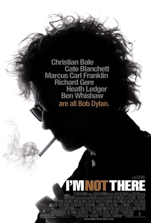
Thinking about the idea of introducing a new sans serif typeface, we suddenly remembered a quote about Stanley Kubrick, a quote that has been posted on a lot of (typo)graphic forums. It's a quote pulled from an article in The Guardian, describing Kubrick's obsession with the typeface Futura: "It was Stanley's favourite typeface. It's sans serif. He liked Helvetica and Univers too. Clean and elegant".
We used this quote as a starting point for our poster. Since Kubrick was clearly so interested in sans serif type, we figured that the best context to show a new typeface would be a poster for one of Kubrick's movies; the ultimate testing environment for a sans serif. Also, a movie poster is a very recognisable format, so we thought it would fit quite naturally in Kai's series of posters.
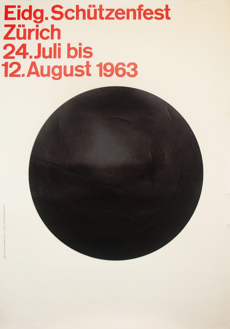
While we were thinking about this plan (to design a completely typographic poster, as a sort of hybrid between a film poster and a type specimen), we suddenly had another idea. We realised that the most 'neutral' letter of a sans serif alphabet would be the 'I', as it is just a black vertical bar: it could be either a capital 'i' or an undercast 'L'. In fact, it is the context (the word in which the letter is placed) that decides whether the 'I' is an 'i' or an 'L'. At that point, we made the connection between this neutral 'I', and the black monolith that plays a central role in Kubrick's '2001: A Space Odyssey'.

From the screenplay of '2001: A Space Odyssey' (1965), by Stanley Kubrick and Arthur C. Clark:

Dr. Heywood R. Floyd:
Any clue as to what it is?

Dr. Bill Michaels:
Not really. It's completely inert. No sound or energy sources have been detected. The surface is made of something incredibly hard and we've been barely able to scratch it.

Floyd:
But you don't have any idea as to what it is?

Michaels:
Tomb, shrine, survey-marker, spare part... take your choice.


So that is, in short, the idea behind the poster. The neutral sans serif 'I', shown as black monolith, in the form of a film poster.


From EXPERIMENTAL JETSET

Totally Ingenious


via FFFFOUND

16.4.09

Periodic Table of Typefaces


The Periodic Table of Typefaces is obviously in the style of all the thousands of over-sized Periodic Table of Elements posters hanging in schools and homes around the world. This particular table lists 100 of the most popular, influential and notorious typefaces today.

As with traditional periodic tables, this table presents the subject matter grouped categorically. The Table of Typefaces groups by families and classes of typefaces: sans-serif, serif, script, blackletter, glyphic, display, grotesque, realist, didone, garalde, geometric, humanist, slab-serif and mixed.


Read more about this (super awesome, super nerdy) project over at THE BEHANCE NETWORK

I must own this shirt


Helvetica Neue UltraLight. You sexy thing.
This shirt is so me, I might've thought I designed it.

URBAN OUTFITTERS

11.4.09

A Comprehensive Birthday Wish List

I'm turning 21 on May 7th and I haven't really expressed what I wanted yet. So, I pulled some ideas from this very blog, and from Amazon, and from my head, and came up with my ideal birthday wish list:

HELVETICA MOLESKINE


BRIXTON


ARCADE FIRE "COLD WIND" 7" SINGLE


This as a Tattoo


A NEW BED! (and new bedding)


MOLESKINES for everyday use (since I don't think I could messy up the Helvetica one)


A ticket for ROCK THE GARDEN

I'm fully aware that this is a pretty big list and don't expect to get half of it, but I can dream, right?

6.4.09

A new kind of math


I urge you to check these out. I giggled a lot over them. Awesome.

MORE NEW MATH

5.4.09

Cut & Paste Digital Design Tournament


it doesn't much matter that this is irrelevant because it was in London, but oh my god, this poster is SOCOOL!

CUT & PASTE

I wonder how that happened


I didn't cheat!
Find out what font you are via FACEBOOK