15.12.10

Max Dalton


Meet Max Dalton! I'll let him do his own introduction, since I don't think I could do it justice:
In order to stop being a stranger to you I will tell you some things about me. I'm Maxim Dalton, an illustrator living in Buenos Aires, Argentina. I've been illustrating since I was two or three, just like any other kid, and began to take it seriously at the age of thirteen. In the lats twenty years I've been involved in several projects like drawing humor strips for a local magazine, creating animations for the TV and doing some editorial illustration. I'm very open-minded and my interests are very dissimilar, but I'm not going to enumerate them all because I don't want to bore you. I just may say that I like to write, oil paint, take photographs, play music and read about animal behavior. I speak five languages and lived in Barcelona and Paris. I also spent some time in New York. I feel comfortable when I find myself surrounded by mid century objects and imagery, and they all inspire me to do the best thing I know: to draw. Now, you can call me Max.


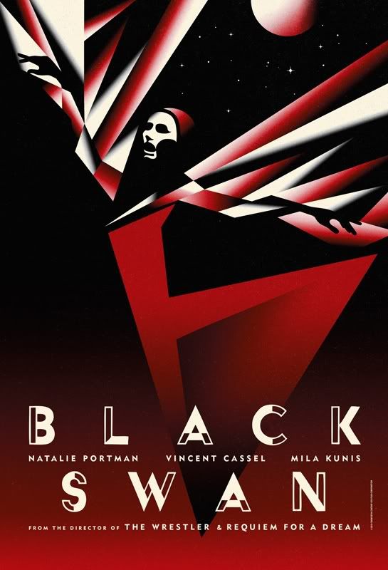
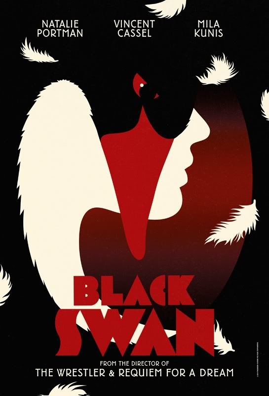
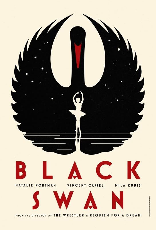
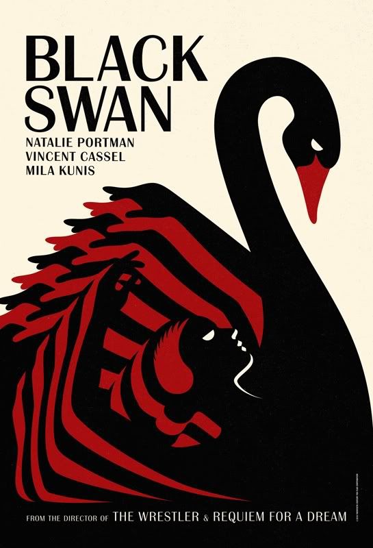
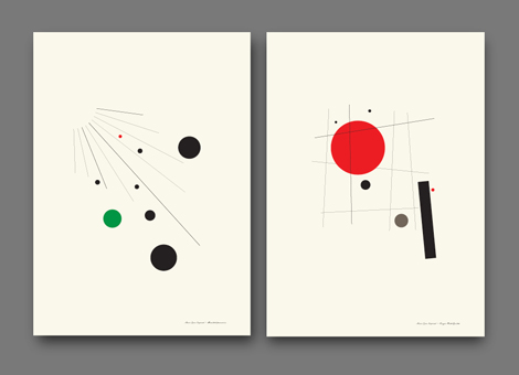
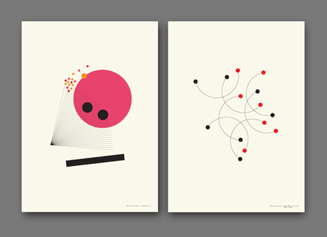
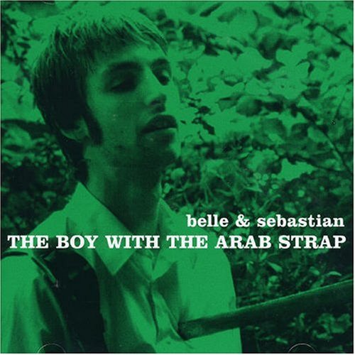
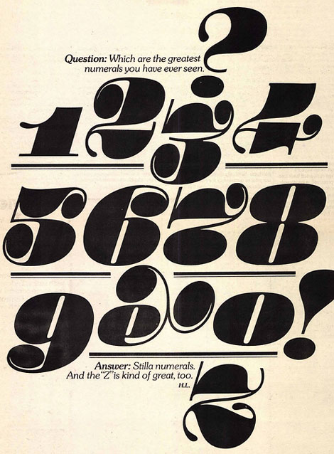
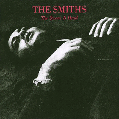
He sounds pretty rad to me. His illustrations are totally legit and it was hard to select only a few for here. I highly recommend looking through his illustrations and then checking out his blog. Personally, I'd love to have his Cocktail Party Cut Out Set. Brilliant ;)

6.12.10

'T' Shirts by Masashi Kawamura


A totally awesome concept from Masashi Kawamura. Combining typography and fashion into these clever "T" Shirts:
‘T’ shirts are T shirts that was designed to have the silhouette of 5 famous typefaces; Helvetica, Caslon, Baskerville, Courier, and Cooper Black.

In the world of typography, terms such as typeface, character, body, etc are used to describe the form of a letter. The reason why they use expressions closely related to a human body, is perhaps because each different letter has a distinct quality and personality, in a similar way that us humans are all unique.

In the designing process of these shirts, I aimed to capture the character of each typeface and tried to give them a unique look and presence once worn. By collaborating with Itaru Yonenaga, I feel we were able to produce a collection of shirts that is not only conceptual, but wearable as real clothes. I hope you will find your favorite shirt/typeface.

The Helvetica one is definitely my favorite, besides the obvious reasons. It's hip, minimal, and kinda androgynous. These will be available for purchase in January, but I must warn you, they're incredibly expensive (Helvetica is the cheapest at $230). I don't think I'd be able to justify buying one right now. When I have the money, though, you just wait...

(via Nubby Twiglet)

4.12.10

Erin Jang's Holiday Cards


What a charming, simple and awesomely retro holiday card from Erin Jang.

Blog redesign

I figured I should make my blog layout match my sensibilities. I had the old design since Spring 2008 so it definitely needed a bit of a lift. Way sexier.

Hello Couture


via WANKEN: "Stumbled upon this elegant project by Ryan Atkinson on Behance. The project was a mini poster series that brought design, typography and a bit of fashion together as a collaboration."

I'm dying from the sexiness.

More on Behance. (It's so worth it)

3.12.10

"Black Swan" movie posters


I'm not sure who the designer is behind these awesome pieces, but I quite like Empire's description of them:
A rather special and gorgeous treat for you today: four pieces of limited edition Black Swan international teaser artwork for you to feast your eyes upon. Yes, they're as beautiful as Natalie Portman and as downright sexy as Mila Kunis - while being as strange and disturbing as Vincent Cassel and as original as director Darren Aronofsky. You're welcome, world.

I'm loving the Propaganda feel, even though I'm sure they have nothing to do with the actual plot.

22.11.10

Sony Ericcson Campaign


Petronio Associates is the creative agency responsible for this Sony Ericsson campaign. They mainly focus on servicing fashion, beauty and art industry brands with advertising, visual identity, packaging and the brand’s overall direction.

via WANKEN

16.11.10

Belle & Sebastian album covers


This is a follow-up to my recent post about Smiths Album Covers, where I felt the execution of duotone images wasn't quite successful. Another British Indie band, Belle & Sebastian, have the same theme running through their album covers, but to a much more pleasing effect.

15.11.10

Numbers


YOU'RE WELCOME.

4.11.10

Chris Larson


I've been meaning to talk about my favorite local graphic designer Chris Larson (he doesn't appear to have a website at the moment) and now that I've come across this gorgeous piece on LOL/OMG, I figured it was the right time. Chris does fabulous work time and time again, and every time I see something from him, I'm impressed (the couple times I've met him, I've been kind of a blathering idiot, just telling him how rad he is).

See the SCENEaSOTA lookbook HERE.

Also, I urge you to check out the [OUTSTANDING] lookbook he created for Voltage: Fashion Amplified HERE.

Smiths Album Covers


Not sure what it is about Morrissey's obsession with serif fonts and duotone images. I'm currently endeavoring on a poster that's based off a Smiths album cover. It... Wasn't too hard, to be honest. I suppose, even though these covers sort of lack in design (except I suppose The Queen is Dead... And Louder Than Bombs. I can't explain my attraction to that one..) they are very distinctive. It makes sense, though, that Morrissey would insist on designing them himself, despite the fact he had no sort of experience in that kind of thing.

EDIT: For future reference...

3.11.10

You & Me


D'awww. From Teconlene

(via Brooklyn Bride

Long live Helvetica.


My favorite teacher in class just now said we are NOT ALLOWED to use Helvetica in our current project, because she says it's too easy to use it, and it has no character, etc... This surprised me first of all because I thought she was a fan. I know she likes the Swiss Style and modern design. How can you like those things and not like Helvetica? Well, bollocks to that. I'm going to continue to use Helvetica in this project and prove its worth. Viva Helvetica!

1.11.10

Vintage Irish Book Covers


This is interesting. I understand that there is a ton of material to work with for a Vintage Poster Blog, but one that is specialized specifically towards "Vintage Irish Book Covers"? Whoulda thought there'd be so much to work with? This blog features items such as old record sleeves, but mostly this is a cool collection, and such good vintage.

VINTAGE IRISH BOOK COVERS (the blog design is pretty nifty too!)

Via Grain Edit

28.10.10

Paris v New York


Such an excellent series by graphic designer Vahram Muratyan. Above are a few of my favorites, but there are a ton of these things! Very clever and cheeky. Go check them out

(VIA

27.10.10

Vintage Poster Blog


Here's a fun blog. Quad Royal collects vintage posters from all eras and displays them... So the rest of us don't have to! A valuable resource.

26.10.10

The Smiths


People who know me know I'm absolutely gaga for The Smiths. I've stopped using the term "favorite band," because it tends to change every once and a while, but they're definitely in my top 5.

Anyway, here's some limited edition prints that made me heart go thump thump thump. You can buy them HERE.

(via CUP OF JO --my favorite blog, which I love even more now.)