2.11.09

Beatles Flow Chat


Ah, flow charts. Like Venn Diagrams, they're provide and excellent template for cheeky design. I saw this on ffffound this morning, then just now and felt like I had to post it. It's a very nicely done chart, with clean lines and a simple monochromatic color scheme.

via SWISSMISS

31.10.09

Stylish Forecast


I love this minimal and elegant way of reporting the weather. I especially love the image they use for a rainy day. As they don't have Minneapolis available (yet), I have London bookmarked... I'm just all too wistful for the city.

HOW'S THE WEATHER

29.10.09

Wishlist- Tiny Mid-Century Modern Chairs


Look at these gorgeous little goodies! I have mentioned before that I have a great love of chairs, and today on Mod Cloth I have found these. Scaled down versions of iconic chairs from probably the best and coolest era for design. I would, of course, love to have all of them.

The only downside is that you can't choose which chair you buy--each one is supposed to be a surprise, which I think is silly if you want to collect them all. And this is true for any place you want to buy them from (unless you intend to buy the set of 9)

There are 5, count 'em FIVE volumes of this dynamic collection. So be sure to snatch them up now before they're obsolete.

BUY

26.10.09

UK Police Adverts


I just found this on Flickr, and had to share. Obviously to residents of the UK... Or perhaps to people who have BEEN to the UK, this is nothing new. But despite my strong love of all things British, I have never been... It's fun to see little bits of England here and there--and especially things pertaining to design.

If there are two things I love, it's Graphic Design and the UK.

Anyway, this is great, and strongly recalls the Keep Calm and Carry On posters of old.. I think that's probably what they were going for. It's modern propaganda to be sure. Well done, Britain.

20.10.09

Album Covers- Keane


As long as I'm on a geometry kick right now, I thought I'd feature Keane's latest album cover, which is nice and clean. Not sure what it is about triangles and polygons lately, but I'm really drawn to them.

The eyeballs are, you know, a little weird. But I'll let it slide. Such a departure from their last album cover, which was also beautiful for different reasons (and designed by Sanna Annukka)

Wind Power?


I was drawn immediately to the cool graphic but THEN I saw what it was for and I had a great moment of comprehension. Great poster!

BIBLIOTHEQUE DESIGN

Seven Days


I don't know why this took me so long, but I have to talk about "Seven Days", which is the work of Christina Couceiro. She's got a fantastic, consistent style. It's well suited to a wide variety of subject matter. Very smart indeed. I'm certainly a fan.

SETE DIAS

19.10.09

Love What You Do


My whole self did the "aww" thing, you know, tilting the head to one side, angling the eyebrows into sympathy mode. It is a fantastically thought out poster and a cute one too. And at the core, the truest of true statements.

VIA SWISSMISS

The Ampersand


A whole blog... Dedicated... To the Ampersand. My FAVORITE type character.
Fab.

THE AMPERSAND

15.10.09

Album Covers- Muse


Gives me a strong sense of 70's Sci Fi book covers. Can't stop looking at it, it's just so beautiful and artistic. Probably one of the best album covers I've ever seen.

9.10.09


"our guiding principle was that design is neither an intellectual nor a material affair, but simply an integral part of the stuff of life, necessary for everyone in a civilized society."

I have always felt this way about design (as long as I've been sober to it at least) but I've never been able to articulate it as finely as this. It's a beautiful sentiment. A bit snobbish, but you can't have good taste without being a bit stuck up...

BUT DOES IT FLOAT

words to live by


23PSI

1.10.09

Hello! Lucky


I have to gush about this group that does letterpress. Not only is their work beautiful, but their site is fantastic! They have a full section dedicated to their inspiration as designers. And on top of it all it's stylish and cute and whimsical and romantic. If I wasn't planning on doing my own wedding invitations, I would be giving these guys a call.

HELLO! LUCKY

29.9.09

Vintage Travel Posters


There's a whole wonderful series of these over at DESIGN OBSERVER

Wood Block Print


I'm not entirely sold on the design, but the phrase is pretty damn true.

MARK ANDREW WEBBER

Invasion!


Nice!

DOUBLE STANDARDS

Archivo Cover Series


SEE THE PROJECT

Custom type


Custom typography for each page in the booklet of Margaret Bergers album, Pretty Scary Silver Fairy.


VIA

Daily Drop Cap


The Daily Drop Cap is an ongoing project by typographer and illustrator Jessica Hische. Each day (or at least each WORK day), a new hand-crafted decorative initial cap will be posted for your enjoyment and for the beautification of blog posts everywhere.


DAILY DROP CAP

New York Times Magazine


Beautiful collage from NYT Mag.

Advertisement- "Man Shops Globe"


I've always wanted to have a reason to do something similar to this. Loves.

28.9.09

Rules of Typography


It's a ffffound kind of morning.
Minneapolis Designer. Nice.

EVAN STREMKE

22.9.09

Flora Fauna


From Apartment Therapy:
The Flora Fauna collection of limited-edition prints is based on field guides for bird watching updated in a style reminiscent of the great Charley Harper.


Precious.

19.9.09

Poster Cabaret


More poster awesomeness. I've been making a lot of posters lately, getting a couple gigs here and there.. Looking through this kinda stuff, make me really consider doing it full time. I have to imagine it's a difficult industry to break into, though. But in Minneapolis there is a whole print-buying subculture. My roommate is part of it, you should see our apartment walls...

POSTER CABARET

Around Town: Jägerfest 2009


I actually offered to make the poster for this, and it was discussed briefly, but I didn't hear back. And I'll admit I felt a fleeting stab of bitterness when I saw this, but I must concede it's beautiful. I definitely wouldn't have thought this up.

And that, my friends, is the definition of Good Design.

16.9.09

69 Stunning Gig Posters


There is an absolutely great collection of posters over at this site. Love all of 'em. As I've been doing a lot of posters lately, I'm taking a particularly keen interest in them right now. Go and have a look.

HERE

15.9.09

I've been away...


...taking an unintended hiatus from blogging. Blogging is difficult when you're not in the mood, and I often find myself not in the mood. It's the whole process of resizing pictures that gets me down, I think.

Anyway. Have some Smiths.

KLAS ERNFLO

oh, fffound, do you ever NOT live up to your name?
I found this amazing website by this fabulous designer/illustrator just now and HAD to share his work.


KLAS ERNFLO

2.9.09

Local Poster Series: Drinking With Ian

Ian Rans is something of a local legend in Minneapolis. He hosts a Talk Show on Cable Access where various local personalities come by, have a chat, and share a drink. I myself have never been to a taping (probably because they're really sporadic and he hasn't done one since I turned 21). Anyway. The posters for his shows are really excellent. I don't know who makes them, but have a look:


DRINKING WITH IAN

31.8.09

Interpol poster


This is a truly stunning poster by the firm Factor 27. I found it in a book of Rock posters my Roommate owns. It's just so... I don't know. Adjectives escape me right now. It's a transcendent design is what it is. I love it.

Factor 27. (The only site I could find representative of their work)

25.8.09

War School


Here's a rather striking image.

VIA Creative Review

1.8.09

This is a post where I write about how inadequate I feel.

It's been a little while since I posted anything here. I think I just sort of fell into this slump where I didn't look at design blogs or go to ffffound or anything.

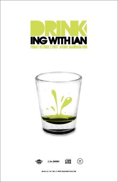
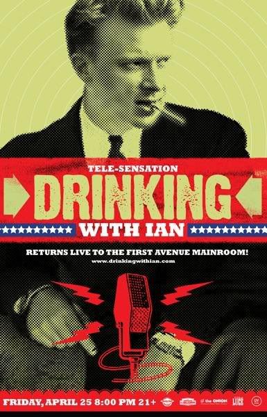
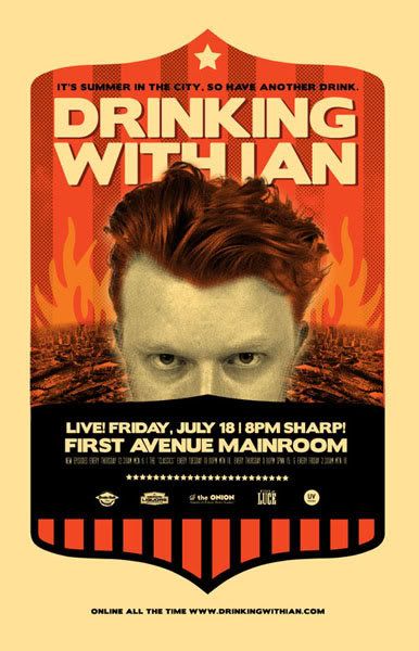
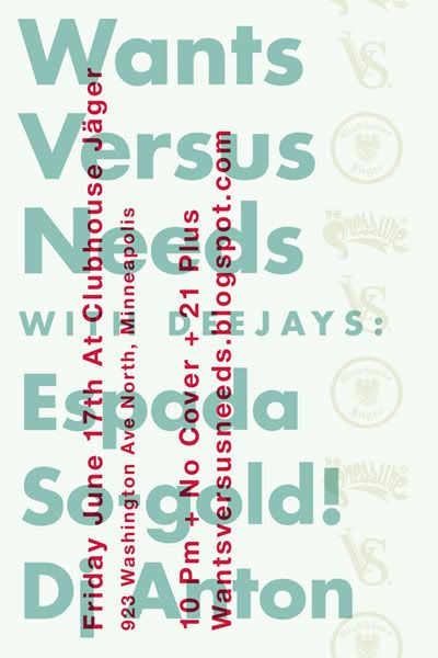
That's not to say I'm in a creative slump. On the contrary, I feel like I have a lot of ideas right now. I recently did a sample project for someone that I am extremely proud of (it couldn't be used, unfortunately, because the event in question already had a GD). But I didn't mind, because I had so much fun doing it. I made my own font and everything.

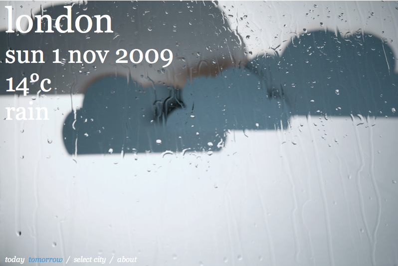
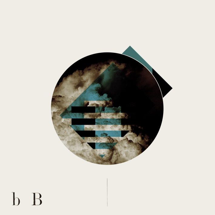
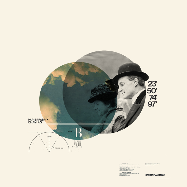
BUT!! the style of the poster was also heavily influenced by Saul Bass. The subject matter practically screamed for it. I wonder; does this make me unoriginal or non-innovative? Will I ever come up with a style or look on my own? I have no doubt that I am creative. I know what looks good and I have specific tastes. I know how to use software and I know about leading and how to kern. I know a fair bit of history and love to learn more every day. I live and breathe my College Major--I'm very lucky! I just think I lack originality.

I also feel like I'll never be educated enough. What if I never learn about printing or letterpress? Or what if I do and I just don't get it? What if I don't have all the typefaces I need, or what if I never expand my boundaries and make everything according to the same template for the rest of my life?

I sincerely hope I am not the first designer to ask these things. I just look around and see so many designers who are so brilliant and resourceful and I wonder how they learned it and if it's something that's coming to me? Or if I don't know it, I don't know it?

Oi. Talk about feeling inadequate.

Slightly related, though more positive; I want to start a "professional" blog, where I post about my own work and talk about it. I have portfolios scattered around the web (I would say my Flickr is the most concise) but I would feel more... Serious? If I had a special place for it.

If I end up making it... It'll be one more blog I have to get out there. I am pretty much unknown in the blog-o-sphere.

24.7.09

The Swiss Style


I love the Swiss Style. I related with it before I knew what it was. Due to a happy accident I was assigned to do a presentation for a chapter in my History of Graphic Design book (for my class with the same name) and the chapter was simple "The International Typographic System", otherwise known as the Swiss Style).

Anyway, I got a heads up from swissmiss on my twitter this morning. There's a great article over at Smashing Magazine all about this modern, minimalist graphic design style. Please do check it out.

17.7.09

Adam R. Garcia of The Pressure


Here is a GREAT flier that had me dead in my tracks by a local designer for a local club. Through a little investigative research I found him so I could feature him on my blog. Surprisingly, his resume is quite large and impressive, and I'm even more disappointed that I hadn't heard of him until now! Anyway, I very much recommend to you all to check out his work. More love to Minneapolis designers.

THE PRESSURE