20.6.09

Vintage Windshield Sticker


Discovered through ffffound, here's a windshield sticker from the 1940's symbolizing gasoline rations. Historical and typographical.

DUKE LIBRARY

Gorgeous type


This is a bit Bauhaus-feeling. I thought at first it was from the 60's. It's so beautiful.

FELIX MÜTHE (I encourage you to check out the website. There's not that much work, but it's all quite stunning)


G-B.AT

Wallpaper* City Guides


I was at Barnes & Noble the other day with my sister, who's traveling to Europe next week. We were looking in the international guidebook sections and kept finding these little Wallpaper* City Guides wedged between books. They're so small and cute! We kept looking around for other ones and it was fun to find them in different colors. They're so wonderfully minimalist and convenient. You can get them for $10 each. Next time I travel I have to get me one of these.

(from Wallpaper* magazine)

PHAIDON

17.6.09

Y-- H--


Mhm.

ROMA PUBLICATIONS

A fine example of our dearest typeface...


Oh I love love love it. Where can I get one of these fine posters?

Modernism


heh, cool.

101 Modernism

The "Save" bookmark


Take a look at this. For computer geeks everywhere, the save bookmark, for when you don't want to dog ear every page in a magazine.

DOWNLOAD the PDF

(via SWISSMISS)

15.6.09

The Quick Brown Fox Jumps Over the Lazy Dog


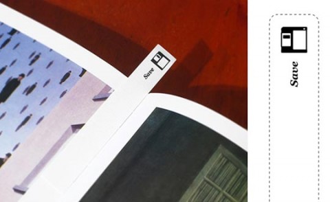
Self-promotion annual gift limited to 300 numbered copies. Intending to share with clients and friends some of the graphic design universe, a typographic Concentration Game was created. It's comprised of 20 pairs of cards, each one presenting a different type family. Extra cards bring a typographical glossary with main terms and the explanation of the sentence witch names the gift: "the quick brown fox jumps to over the lazy dog". The package also contains a text about the evolution of type design, locating in history each font used in the cards.


PS.2 ARQUITETURA

Wishlist- "T" towel


I was just thinking this evening how I wanted some new tea towels. And then I go on a browsing frenzy with KCG and this is what happens. They have other nice tea towels, but this one is simplicity at its most divine.

BUY (YAY)
(I'm going to be really embarrassed when one day this blog starts getting readers and they see how many times a day I updated, fully knowing that I'm the only one getting anything out of it)

Wishlist- "Rarely Eye Chart" print from KCG


It recently dawned on me how cool and graphic Eye Charts are. I really want to get one for my wall, but then I saw this poster which is cleaner and prettier. It's really soft and has a lovely typeface. It would be perfect. And again, it's from the Keep Calm Gallery (I rediscovered it today).

BUY!

Poster of the Day


A very pretty and simple type poster from the KEEP CALM GALLERY

Best thing ever- My Helvetica Moleskine


I actually got this on my birthday, which was more than a month ago. I thought I should talk about it a little on here. Let me see. First, it's absolutely precious. I like holding it and running my fingers over the imprinted cross in front and type on the back. I kept the outside label on just so it's all in one place. There's a cute little file folder in the back and a red cloth bookmark. And best of all, it comes with a brief history of Helvetica.

Currently it sits atop a stack of design books on my desk. <3

14.6.09

The Journal of Popular Noise


I was just perusing through my July issue of NYLON and spotted this tucked away in a small blurb:

If you ever wished that Andrew W.K.--after a career spent making operatic, uplifting rock--would go into the world of infomercials, then you need to hear and read the latest issue of The Journal of Popular Noise. This audio zine, curated by graphic designer Byron Kalet, aims to blend "traditions of pop music, printed periodicals, and the delight of a finely crafted artifact." The journal comes with three 45s (pop), each slotted into origami cardstock (artifact). Carefully unfold the letter-pressed package, and you will find a summary of each recording artist. Kalet grew up making music in Seattle before moving to New York City to study design at Parsons. He founded the journal in his spare time "as sort of a reconciliation between music and magazines," he says. "it was an exploration into the crossover between sound and vision." In addition to W.K., the next issue will feature contributions from former Make=Up front man Ian Scenonius and the sketch-comedy duo of Sarah Walker and Jessie Cantrell.


How cool is that? It's absolutely gorgeous. Each issue, there is a limited edition of 100 letterpress, which is $30. Or, you can get the plain ole version for $15. I don't even need to think about that one.

GET YOUR COPY TODAY

13.6.09

Wishlist- Swiss First Aid Kit Box


I've been perusing SWISSMISS today (mostly the "switzerland related" tag) and saw this great first aid kit box. I'd love it, but to be kept as a tool box, most likely. Plus it's just plain cool because it's swiss. I got swiss on the brain today, I guess.

VINÇON

Anyone Can Swiss


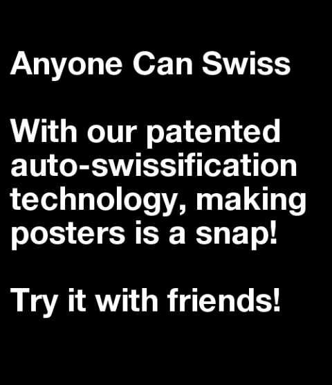
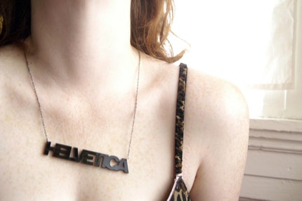
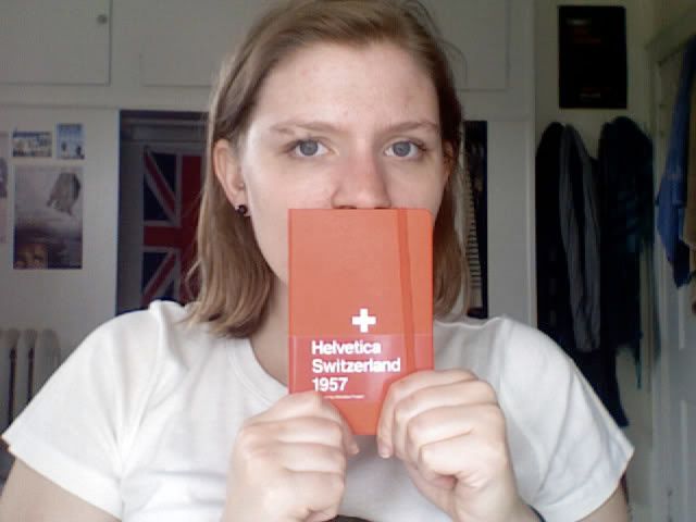
The gloves are off. It has been suggested that our environment is over-saturated with use of Helvetica. Some have even suggested that Helvetica is a complete design cop-out. Others would say that Helvetica and associated signage are beautiful works of art that requires hours at the computer, slaving over letter spacing. This project suggest that perhaps Helvetica posters are so extremely formulaic that perhaps a monkey (or a computer) could do it? This is an experiment in design discourse.

The jury is still out.

Oh dear. This is definitely brilliant, but dammit, Helvetica is not a design cop-out!

ANYONE CAN SWISS

Wishlist- Helvetica Necklace


THIS IS STAR

12.6.09

Wishlist- French Stripe T-Shirt


Woww. I love me some striped t-shirts (seriously, a lot). You can buy this (for me) over at RUMPLO for $35.

Wedding invitation


MATT DORFMAN designed this stunning and immaculate invitation for his wedding. It's a beautiful work of type, and I love the story that goes along with it. How romantic.

(via Design*Sponge)

10.6.09

Wishlist- This shirt


I'm sure I could make it easily enough. But still... It'd be easier if it were ready made.

London Design Festival 2009


This is a really cool yet simple campaign for the London Design Festival coming up in September. Sigh.. I wish I could go.

Check out the rest of the campaign HERE

There is a light that never goes out

Minimalism.


From SWISSMISS:
This Thursday, there will be an auction of posters (designed by James Victore, Strange Attractors, Deb Bishop, Matteo Bologna, and Roberto de Vicq de Cumptich to name a few) at the Type Directors Club. Each of them will be auctioned off on 11 June 2009 (6 pm), with proceeds to benefit the TDC Scholarship fund. That’s right! You can own a little piece of design history, and support design education in the bargain. The posters will be on view at the Club from 21 May to 11 June, 2009


The above poster is absolutely great and designed by Dominic Lippa

New Favorite Design Clique-Public School


Masters of modern minimalism!
PUBLIC SCHOOL

4.6.09

Saving for later


I read a lot of lifestyle blogs, moreso than pure design blogs. I like seeing how stylish people live (except it makes me sick with longing) and usually dream of the day when I get a place all to myself to decorate. This space really stuck out, because it's all very clean and minimalist and all the white stuff gives it a european feel. Anyway, This may be the first and only time I feature a home tour but it's nice to dream of a day I can have complete control over the aesthetic value of my apartment(/house).

UNPLGGED

1.6.09

Oh you sonuva....


If anyone tries to pull this on me, I'll hit you. Hard.

Sad day


I was sad when I saw this because I know I'm nowhere near qualified.

Typographic skateboard


If I skated, I'd be all over it. Good thing I don't, though, because it's $160.

BUDDY CARR

Accuracy


I feel slightly less than intelligent posting this, but it really makes me giggle.