28.10.10
Paris v New York
Such an excellent series by graphic designer Vahram Muratyan. Above are a few of my favorites, but there are a ton of these things! Very clever and cheeky. Go check them out
(VIA
27.10.10
Vintage Poster Blog
Here's a fun blog. Quad Royal collects vintage posters from all eras and displays them... So the rest of us don't have to! A valuable resource.
26.10.10
The Smiths
People who know me know I'm absolutely gaga for The Smiths. I've stopped using the term "favorite band," because it tends to change every once and a while, but they're definitely in my top 5.
Anyway, here's some limited edition prints that made me heart go thump thump thump. You can buy them HERE.
(via CUP OF JO --my favorite blog, which I love even more now.)
25.10.10
Olimpia Zagnoli
How rad is Olimpia Zagnoli? She's got such a great eye for color and illustration, and has had some wicked pieces in various publications such as the NY Times, The Guardian, and Rolling Stone (Italy). And she's only 26 years old! Not that that's terribly young, though to me somehow it does seem that way. She's obviously got a bright future ahead of her.
(Via SWISSMISS)
24.10.10
"True Grit" movie poster
I like the western style [I actually made something simliar a couple years ago. It's nice to see mine isn't necessarily worse than this one above (though the background texture could use work)]. I also like the bullet wound. Movie posters should be more bold like this. It's eye-catching and interesting. Reminds me somehow of working at a movie theater and seeing all the new posters come in and choosing which ones to put up. Memories.
21.10.10
Ering Jang of The Indigo Bunting
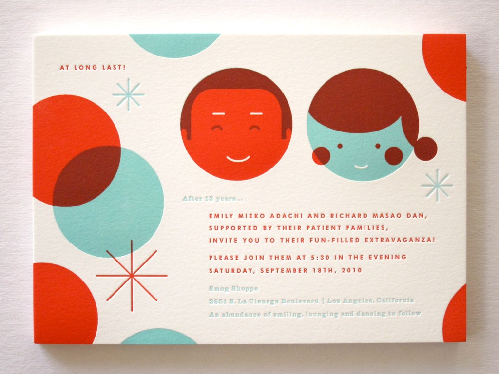
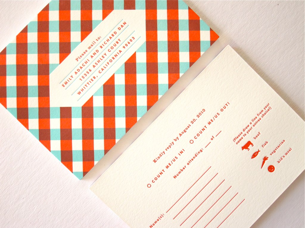
I'm convinced that Erin Jang has the coolest job ever. She designs incredibly immaculate and personalized wedding invitations for couples (who have them letter pressed to perfection), and used to do awesome spreads for Esquire magazine (she now works for Martha Stewart Living). I'm constantly inspired by her use of type and fun, simple graphics. When designing my sister's wedding invitations recently, I mostly thought about Erin Jang and what she would've done. I'd love to just sit down with her and talk.
This invitation suite above hits me more than anything else she's done so far mostly because of the awesome mid-century graphics and fun colors and patterns. Oh, to be her!
19.10.10
Kellerhouse Inc.
Kellerhouse Inc is behind recent movie posters such as I'm Still Here and The Social Network. They've done a ton of work one would definitely recognize. I love the theme with the type on top of the simple image of the face (see also the special edition DVD packaging for The Man Who Fell To Earth. They're very simple, striking designs. And really memorable. Take a look through their work, it's well worth it.
18.10.10
10 Movie Posters Inspired by Mens Style
12.10.10
Rifle Paper Co.
Anna Bond of Rifle Paper Co. creates absolute beautiful pieces (hand-painted with care) for her shop. Everything is absolutely flawless and gorgeous and charming and whimsical. Seeing her beautiful work, and realizing I couldn't do it if I tried, makes me want to cry. It's great that she makes such awesome work and makes a living off of it! I totally want to be her.
3.10.10
Christopher David Ryan
I've apparently been seeing this guy's work for years (and, unbeknownst to me, blogged about him already. [don't even bother to follow that link--the image has been taken offline]), but this is the first time I've put a name on it. CDR (which is like, the same initials as my design name-- Caroline Royce Design), does absolutely smashing illustrations in that awesome retro style that I love so very much. I dig it big time. His blog is simple and to the point, and also features a lot of work from other designers.
I encourage you to Check him out.
Subscribe to:
Posts (Atom)