22.11.10

Sony Ericcson Campaign


Petronio Associates is the creative agency responsible for this Sony Ericsson campaign. They mainly focus on servicing fashion, beauty and art industry brands with advertising, visual identity, packaging and the brand’s overall direction.

via WANKEN

16.11.10

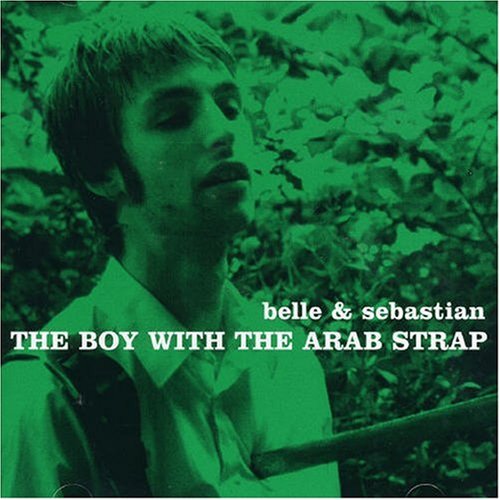
Belle & Sebastian album covers


This is a follow-up to my recent post about Smiths Album Covers, where I felt the execution of duotone images wasn't quite successful. Another British Indie band, Belle & Sebastian, have the same theme running through their album covers, but to a much more pleasing effect.

15.11.10

Numbers


YOU'RE WELCOME.

4.11.10

Chris Larson


I've been meaning to talk about my favorite local graphic designer Chris Larson (he doesn't appear to have a website at the moment) and now that I've come across this gorgeous piece on LOL/OMG, I figured it was the right time. Chris does fabulous work time and time again, and every time I see something from him, I'm impressed (the couple times I've met him, I've been kind of a blathering idiot, just telling him how rad he is).

See the SCENEaSOTA lookbook HERE.

Also, I urge you to check out the [OUTSTANDING] lookbook he created for Voltage: Fashion Amplified HERE.

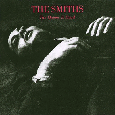
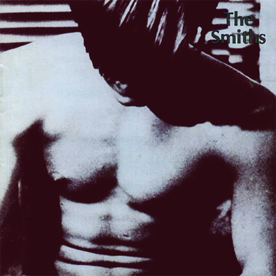
Smiths Album Covers


Not sure what it is about Morrissey's obsession with serif fonts and duotone images. I'm currently endeavoring on a poster that's based off a Smiths album cover. It... Wasn't too hard, to be honest. I suppose, even though these covers sort of lack in design (except I suppose The Queen is Dead... And Louder Than Bombs. I can't explain my attraction to that one..) they are very distinctive. It makes sense, though, that Morrissey would insist on designing them himself, despite the fact he had no sort of experience in that kind of thing.

EDIT: For future reference...

3.11.10

You & Me


D'awww. From Teconlene

(via Brooklyn Bride

Long live Helvetica.


My favorite teacher in class just now said we are NOT ALLOWED to use Helvetica in our current project, because she says it's too easy to use it, and it has no character, etc... This surprised me first of all because I thought she was a fan. I know she likes the Swiss Style and modern design. How can you like those things and not like Helvetica? Well, bollocks to that. I'm going to continue to use Helvetica in this project and prove its worth. Viva Helvetica!

1.11.10

Vintage Irish Book Covers


This is interesting. I understand that there is a ton of material to work with for a Vintage Poster Blog, but one that is specialized specifically towards "Vintage Irish Book Covers"? Whoulda thought there'd be so much to work with? This blog features items such as old record sleeves, but mostly this is a cool collection, and such good vintage.

VINTAGE IRISH BOOK COVERS (the blog design is pretty nifty too!)

Via Grain Edit