

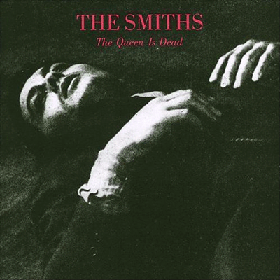
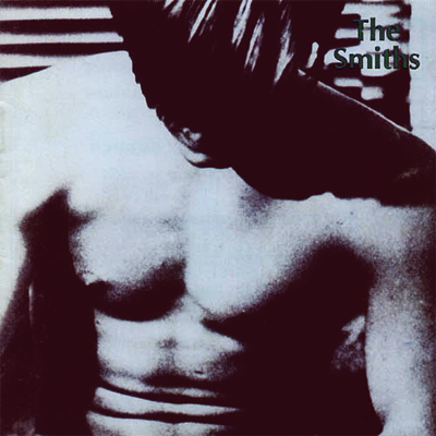


Not sure what it is about Morrissey's obsession with serif fonts and duotone images. I'm currently endeavoring on a poster that's based off a Smiths album cover. It... Wasn't too hard, to be honest. I suppose, even though these covers sort of lack in design (except I suppose The Queen is Dead... And Louder Than Bombs. I can't explain my attraction to that one..) they are very distinctive. It makes sense, though, that Morrissey would insist on designing them himself, despite the fact he had no sort of experience in that kind of thing.
EDIT: For future reference...

2 comments:
I always loved the simplistic duotone look. Whenever I have to make a quick "album cover" for a song, I take the Morrisey road of design.
Strange that "Meat Is Murder" is the only sans serif one... hrmmm.
True, Meat is Murder is really different in structure from the rest.
Post a Comment